 [Image Courtesy of Sam Falconer]
Migration, the Recession, and Happiness
Since the United States replaced its national origins quota system with the Immigration and Nationality Act of 1965, immigration to the US has more than quadrupled to date (1). From the 60’s to the 2000’s, the US has maintained itself as a top destination for immigrants worldwide. In our Data Science class this semester, we examined migration patterns through network analysis that corroborate this fact. You can find a great video of where everyone has emigrated to the US from since 1820 here (4):
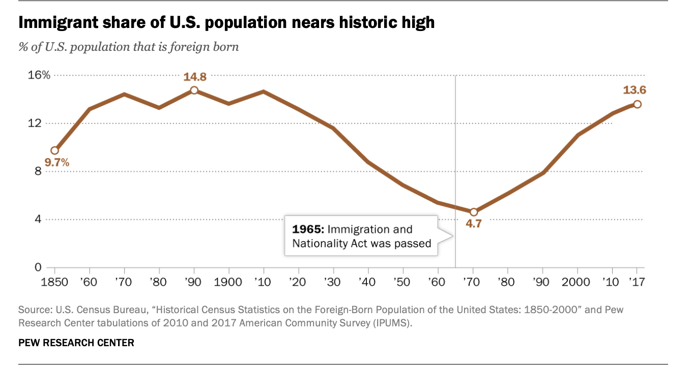 [Pew Research Center]
However, the 2008 financial crash and subsequent recession in the US made serious economic dents in both the US and in countries worldwide; in the wake of this crisis, was the US still seen as the prosperous land which drew in migrants seeking to attain the American Dream? Have migration changes from this time frame normalized? We intend to explore this topic in our project.
When we will discuss migration in this blog post, we are referring to documented human migration from country to country, with emigration referring to people leaving their origin country and immigration referring to people arriving to a new country. More cool facts on migration generally can be found at this link!(2)
Below is a graphic depicting some reasons why people migrate, including occupational (finding a new job), family, education, or to seek better living conditions. In these cases and those of forced migration, or when some people need to seek asylum or are fleeing discrimination, we consider that these people are pursuing happier lives or prosperity elsewhere. Is this really the case, does the data support that people tend to migrate to places where people are happier? What factors are most important when thinking about happiness? We want to further explore what encompass people’s happiness, and then analyze the relationship between happiness and migration patterns across the world, through a network analysis of migration.
European Commission(3) 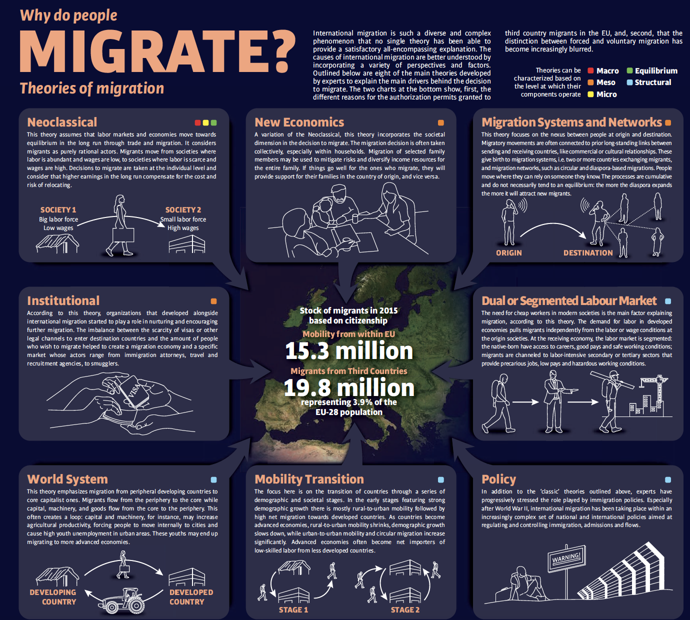 Regarding
happiness, the indicator variables that we would like to explore that we
believe play a part in it such as institutional features like CO2
emissions, GDP per capita, and Health expenditure, but also cultural and
political features such as perceived corruption, generosity, democratic
quality, and poverty.
For the Happiness measure itself, we will use the “Life Ladder” Survey question from the World Happiness Report which asked surveyed participants to answer the question, “Please imagine a ladder, with steps numbered from 0 at the bottom to 10 at the top. The top of the ladder represents the best possible life for you and the bottom of the ladder represents the worst possible life for you. On which step of the ladder would you say you personally feel you stand at this time?”
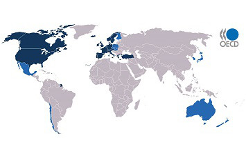
The OECD countries are those which belong to the Organization for Economic Cooperation and Development. The majority of its 35 members are in Europe, but also includes some in the Americas and Pacific. Its goal is to promote the economic welfare of its members through analyses of various indicators annually, including education, labor, health, and technology (5). Based on available country-level data on inflows and outflows for migration, we decided to focus on these countries. Further, given we are interested in seeing how the 2008 recession impacted migration in the US, it would make sense to do this analysis in comparison to comparable economically prosperous nations.
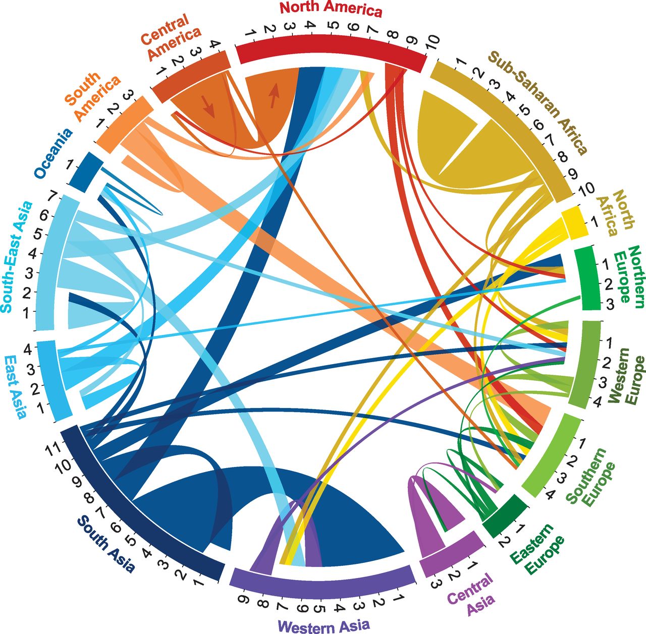 Plot of migration flows between and
within world regions during 2005 to 2010 (Sander, Abel,
Bauer)(6).Thickness indicates heavier migration flows. Line distance
from region indicates origin country (further) and destination country
(closer).
Data
Given the indicator variables we wanted to explore, and the relationship we wanted to build between migration and happiness, we had to go through several sources:
-
The UN Department of Economic and Social Affairs Population Division collects and makes data publicly available on international migration. At a higher level to simply see total inflows and outflows, they account for a majority of countries globally. However, given the type of data needed to create a network, not all countries had available inflows and outflows and where these migrants were coming from/going to, which has left us with a subset of OECD countries (28) to analyze from 2008 (recession year) and onward until 2013, when the latest available data has been recorded.
-
The World Bank provided us with several variables that could serve as indicators for Happiness (“Life Ladder”), as they collect data on an annual basis with factors related to economic prosperity of countries globally. This dataset provides Homicides (proxy for crime), life expectancy, literacy rates, population, poverty, unemployment rate, CO2 emissions, GDP per capita, and Health expenditure.
-
Gallup World Poll has been releasing a World Happiness Report since 2008 on approximately 150 countries through randomly surveying people in each country and asking them questions about their happiness and other factors which may be related to happiness (such as Generosity, Democratic Quality, and Perceptions of Corruption)
Links to our data sources which are downloadable and free for public use can be found below in the References section below. A full data book with lists of variable explanations can be found in References.
To set up the data, we had to do a significant amount of cleaning and joining of datasets. We first converted the migration data into csv formats for each individual country to read them into R, and then combined them using a for-loop and rbind(). We had access to data from several years before 2008 for migration, so we filtered to only look at 2008 and on. Next, we needed to label our population inflows and outflows for every given country since we are trying to do a directional network analysis and the original datasets had a column denoting immigrant or emigrant for a given country. So, by creating a new column using conditional statements to label each country with either an origin or destination code, we are able to create our country networks. We then had to join the happiness data and World Bank indicator variables into each country-level network data.
Network Analysis
Initial Setup
We first run weighted centrality statistics to identify the top 5 countries in a given year (for this example we ran it for 2008) which have the highest overall volumes of inflows or outflows.
Before doing so, we need to filter out the dataset such that only 2008 migration data is graphed in the network:
# Filter for 2008
migrationflow_2008 <- migration_all %>% filter(Y2008 > 0) %>% select(origincode, destcode, Y2008)

# Create directed network
migration2008 <- igraph::graph_from_data_frame(migrationflow_2008, directed = TRUE)
summary(migration2008)

## IGRAPH 6c77116 DN-- 215 5401 --
## + attr: name (v/c), Y2008 (e/n)
Our graph has 216 countries (vertices) and 5,401 migration routes between them (edges) in 2008.
# 5 Most Popular Destination Countries (Most People Coming In)
top_dest2008 <- strength(migration2008, weights = E(migration2008)$Y2008, mode = "in")
sort(top_dest2008, decreasing = TRUE)[1:5]

##  United States        Germany United Kingdom          Italy          Spain
##        1083781         562718         540481         518284         513112

# 5 Most Popular Origin Countries (Most People Leaving From)
top_orig2008 <- strength(migration2008, weights = E(migration2008)$Y2008, mode = "out")
sort(top_orig2008, decreasing = TRUE)[1:5]

##        Germany United Kingdom        Romania         Poland          Spain
##         559917         472761         326583         263273         231672
The top 5 countries with highest immigrant inflows in 2008 in descending order are the United States, Germany, United Kingdom, Italy, and Spain. Alternatively, the top 5 countries with the highest emigrant outflows in the same year are Germany, United Kingdom, Romania, Poland, and Spain.
To see if this changed over time, we repeated the process for 2013 data.
## IGRAPH c6c4598 DN-- 206 4489 --
## + attr: name (v/c), Y2013 (e/n)
Our graph for 2013 migration has 205 countries with 4,489 migration routes between.
# 5 Most Popular Destination Countries (Most People Coming In) in 2013
top_dest2013 <- strength(migration2013, weights = E(migration2013)$Y2013, mode = "in")
sort(top_dest2013, decreasing = TRUE)[1:5]

##  United States          Italy         Canada United Kingdom          Spain
##         976629         279014         256732         243826         212750

# 5 Most Popular Origin Countries (Most People Leaving From) in 2013
top_orig2013 <- strength(migration2013, weights = E(migration2013)$Y2013, mode = "out")
sort(top_orig2013, decreasing = TRUE)[1:5]

##          Spain United Kingdom         Mexico          China          India
##         411020         264668         145034         138971         129965
Compared to 2008, in 2013 the top 5 countries with the highest immigrant inflows were, in descending order, the United States, Italy, Canada, United Kingdom, and Spain. For emigrant outflows, the top 5 were Spain, United Kingdom, Mexico, China, and India. Across all years ,the countries with the highest documented migration inflows appear to be the United States, the United Kingdom, and Spain, and the countries with the highest documented migration outflows are Spain and Germany.
After the initial centrality analysis, we then examined the top edges in each country’s network, that is, the countries that the migration was most frequently occuring to or from. For example, below is the output of the top countries people originally from Germany were migrating to in 2008:
## # A tibble: 10 x 3
##    origincode destcode                  Y2008
##    <chr>      <chr>                     <dbl>
##  1 Germany    Poland                   119649
##  2 Germany    Romania                   37778
##  3 Germany    Turkey                    34843
##  4 Germany    Italy                     25846
##  5 Germany    Hungary                   21454
##  6 Germany    United States of America  19019
##  7 Germany    Greece                    16079
##  8 Germany    Bulgaria                  15990
##  9 Germany    Austria                   15791
## 10 Germany    Russian Federation        13881
To see whether these countries changed over time, we repeated this code for the rest of the years.
##   origincode           Y2008                  Y2009                 Y2010
## 1    Germany Poland (119649) United Kingdom (12250) United Kingdom (7915)
## 2    Germany Romania (37778)   United States (7583)  United States (6888)
## 3    Germany  Turkey (34843)          Canada (3887)        Belgium (3099)
## 4    Germany   Italy (25846)   CzechRepublic (3378)         Canada (2956)
## 5    Germany Hungary (21454)      NewZealand (2588)  CzechRepublic (2548)
##                    Y2011                 Y2012                Y2013
## 1 United Kingdom (14361)       Austria (13513) United States (6032)
## 2        Austria (13994) United Kingdom (8771)       Belgium (2407)
## 3   United States (6125)  United States (5812) CzechRepublic (1878)
## 4         Belgium (2886)        Belgium (2681)       Denmark (1785)
## 5          Canada (2053)        Denmark (1822)        Canada (1217)
Over time, it appears the top countries people from Germany are moving to remains relatively the same, with United Kingdom, the United states, Denmark, Canada, and Belgium appearing consistently most years. We repeated this for all of the top 5 countries from 2008 and found similar results.
Shiny App
To allow users to explore highlights from our network analysis, we created an interactive Shiny App in which users can select an OECD country of interest and look at its individual networks and yearly inflows and outflows. They can also compare happiness measures and other indicator variables using the data codebook link provided at the top of the Shiny application as well as at the bottom of this blog post. The link to the app can be found here.
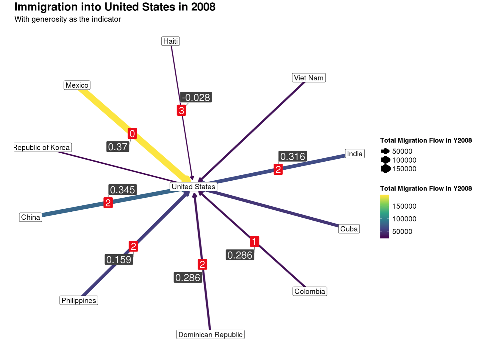
Lighter, brighter, and thicker paths indicate heavier migration flows, or larger populations of people moving from origin to destination. Differences in happiness score from country of origin to country of destination are labeled in red squares on the network. The user has the ability to choose an indicator variable of interest, and the difference in this indicator variable from the country of origin to the country of destination is indicated in the gray squares. Many migration flows do not have either measurement due to a lack of data. However, for the flows that do have enough data for interpretation, we found that destination countries often had higher happiness scores than the origin countries.
Findings on Migration Flow and Happiness
To summarize the results from our research, consider the network below of immigration into the United States in 2008, screenshotted from our Shiny application:
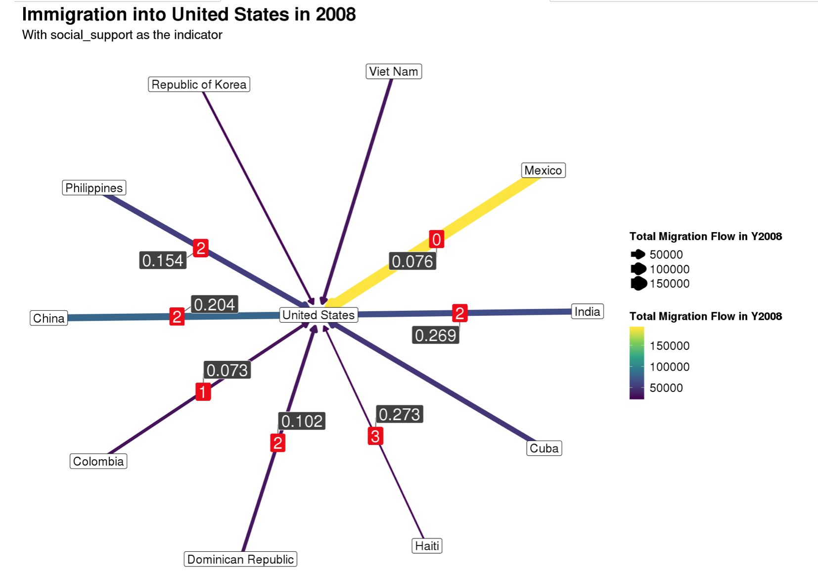
Most of the immigrants were either from Mexico, China, or India, as indicated by the thickness and lightness of the three pairwise paths in the visual above. In addition, most immigrants coming into the United States in 2008 were coming from countries with distinctly lower happiness scores than the US, the biggest difference being between Haiti and the US. This finding was consistent across the majority of the countries we examined as well, which intuitively makes sense as we would expect people to want to move to countries that are doing just as well as, if not better than, their current country. Same patterns can be seen across indicator variables as well. An example is with generosity as the indicator variable for migration into the US in 2008.
We can also consider a different year. Keeping the United States as the destination point, 5 years after the Recession in 2013, we get an understanding of how migration flows have changed (or not changed).
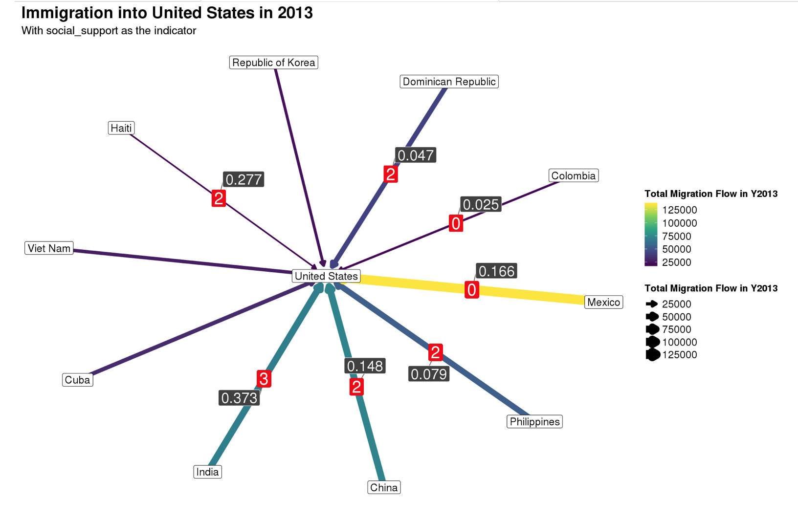
Looking at both the inflows and outflows for the United States in 2013, we see the results were the same, with most immigrants coming in from either Mexico, China, or India.
We also considered other countries as destinations to see if the results of the potential relationship between migration and happiness were consistent across countries.
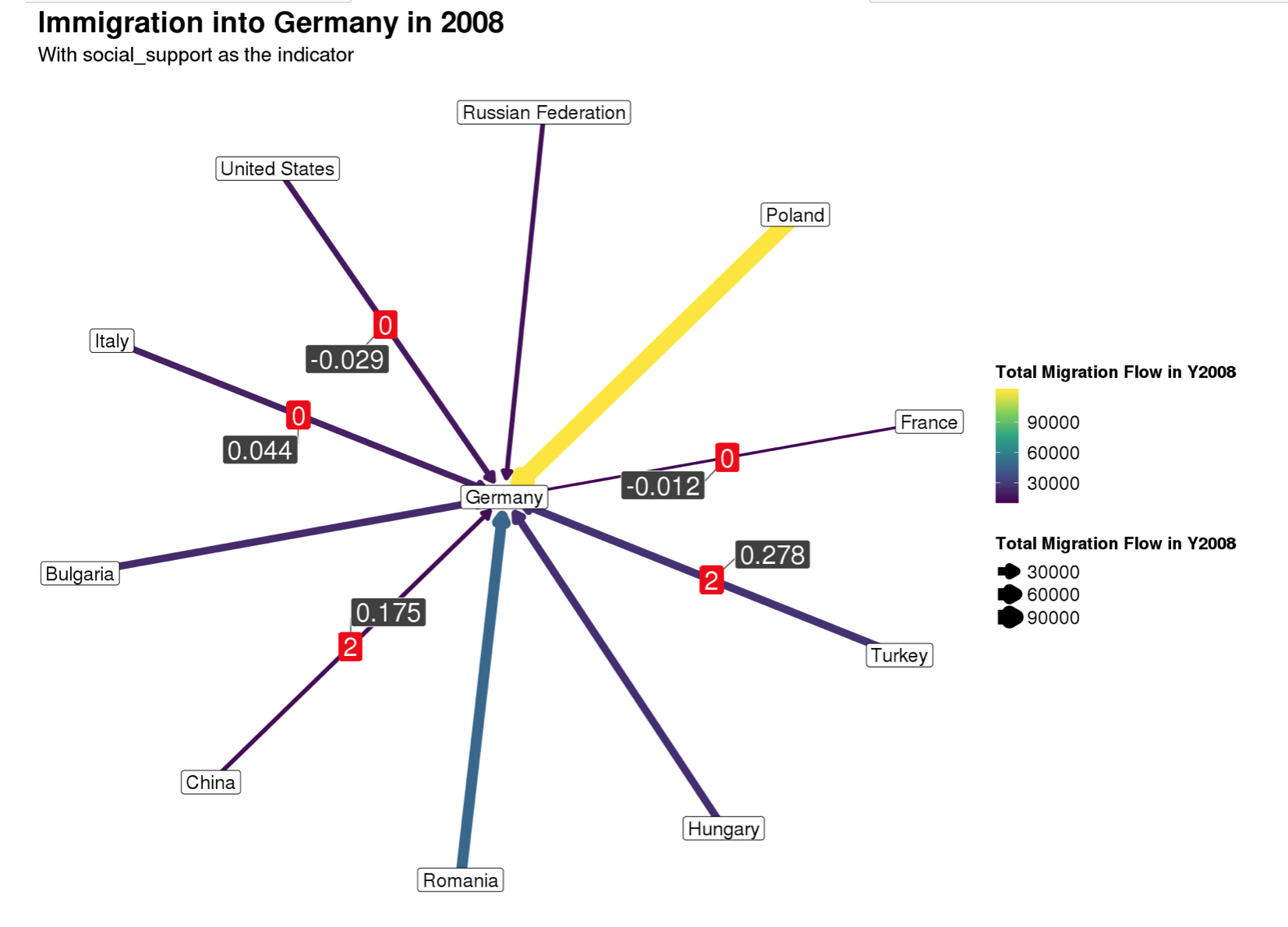
While the relationship between happiness scores and migration seem to remain for immigration into Germany in 2008, the relationship between migration and indicators for happiness does not seem to translate over. If anything, the social support seems to be worse in Germany than some of the countries of origin. Same goes for other indicators, such as the country’s confidence in their government.
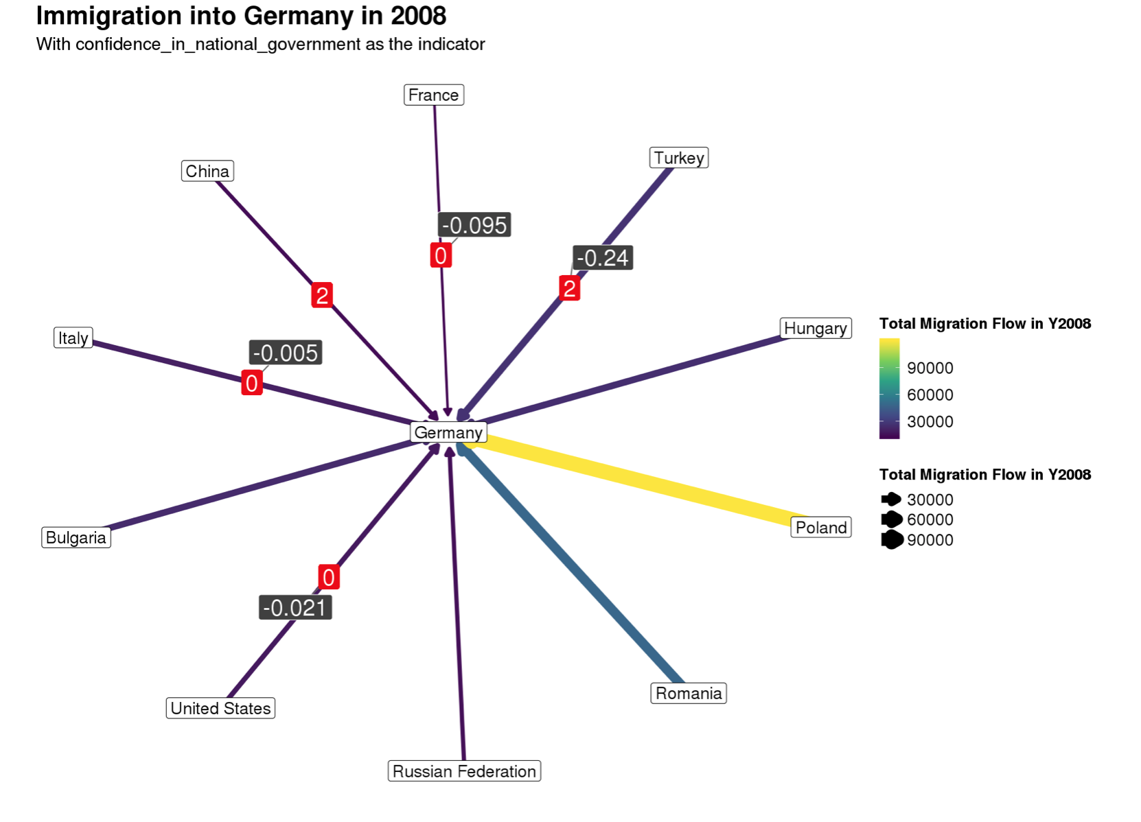
To recap our results, it appears that people tended to migrate to places with higher or equal average happiness scores than their origin country. A somewhat synonymous relationship appeared to exist for the indicator variables as well, though not as frequently as it did for happiness scores. Given the potential of relationship, we wanted to further explore what indicators can help predict happiness.
Findings on Happiness Predictors
PCA
What is it?
PCA is a type of exploratory data analysis which helps in dimension reduction. The basic goal of a PCA is to describe the variation of a set of correlated variables in terms of a new set of uncorrelated variables. Using PCA we could potentially see patterns in the data set that were not originally visible
We decided to do a PCA because we wanted to figure out the most the most influential variables in the happiness data set and see if there are any patterns behind what makes countries happy. We believe, given our findings, governments could focus on policies that improve factors that are directly linked to happiness.
Wrangling was necessary to generate the principal component analysis output below.
happiness_numeric <- happiness %>% select(-c(1,2,3,4))
# Since a PCA can only be done on quantiative variables, we had to remove the categorical variables before we proceeded with our PCA.

happiness_original_na <- na.omit(happiness)
happiness_na <- na.omit(happiness_numeric)
# We had to omit the N/As which significantly reduced our dataset unfortunately.

happiness_scale <- scale(happiness_na)
# We scaled our variables because all did not have the same scale and did want some indicators dominating our PCA.

happiness_PCA <- princomp(happiness_scale)
summary(happiness_PCA)

## Importance of components:
##                           Comp.1    Comp.2    Comp.3     Comp.4     Comp.5
## Standard deviation     2.4377374 1.8311555 1.5574714 1.36255233 1.22692065
## Proportion of Variance 0.2729599 0.1540194 0.1114205 0.08527688 0.06914454
## Cumulative Proportion  0.2729599 0.4269793 0.5383998 0.62367665 0.69282119
##                            Comp.6     Comp.7     Comp.8     Comp.9    Comp.10
## Standard deviation     1.15521050 0.99596445 0.87973189 0.79054353 0.74504395
## Proportion of Variance 0.06129813 0.04556303 0.03554886 0.02870625 0.02549698
## Cumulative Proportion  0.75411932 0.79968235 0.83523120 0.86393746 0.88943444
##                           Comp.11    Comp.12    Comp.13    Comp.14    Comp.15
## Standard deviation     0.73043876 0.61966425 0.59207454 0.51135434 0.47981917
## Proportion of Variance 0.02450714 0.01763753 0.01610192 0.01201071 0.01057499
## Cumulative Proportion  0.91394157 0.93157911 0.94768103 0.95969174 0.97026674
##                            Comp.16     Comp.17    Comp.18     Comp.19
## Standard deviation     0.439293978 0.430418691 0.35154838 0.283346130
## Proportion of Variance 0.008864116 0.008509562 0.00567669 0.003687733
## Cumulative Proportion  0.979130853 0.987640415 0.99331710 0.997004838
##                            Comp.20      Comp.21      Comp.22
## Standard deviation     0.224628048 0.1078776665 0.0557837334
## Proportion of Variance 0.002317677 0.0005345496 0.0001429355
## Cumulative Proportion  0.999322515 0.9998570645 1.0000000000

# Using the Joeliffe's Rule we decided to keep 7 Principal Components in our analysis.

# print(summary(happiness_PCA), loadings = TRUE)
The loadings can be generated by uncommenting the last line in the code chunk above. From this, we deduced that:
The first principal component that explained 26.7% of the happiness data for GDP Per Capita, Democratic Quality and a High Life Expectancy suggesting that a long wealthy are life is the key to Happiness.
The second loading had high negative loadings for Positive Affect and Government Health Expenditure.
Freedom to make life choices, confidence in national government and positive and negative affect had high loadings for the third principal component. This suggests that good public sentiment and freedom are also essential to Happiness.
The fourth principal component was similar to our first principal component.
The fifth principal component suggested that a key to happiness was lesser corruption in government.
The sixth and seventh principal components had high loadings for unemployment rate and equality.
Using the Joeliffe’s rule which tells us to keep the principal components that have a standard deviation of greater than one, we decided to retain 7 principal components in our analysis. Next, we decided to look at the loadings of the Principal Components that we decided to retain.
Therefore, the aforementioned interpretations of the principal components suggest that these indicators are the most crucial to happiness in a country. >> insert what’s necessary here if anything else is needed
These results can be better interpreted when visualized using the
ggbiplot package.
ggbiplot::ggbiplot(happiness_PCA, groups = factor(happiness_original_na$happiness_score))

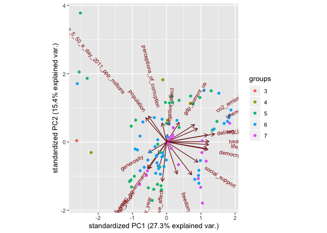
ggbiplot::ggbiplot(happiness_PCA, choices = c(1:2), groups = factor(happiness_original_na$happiness_score))
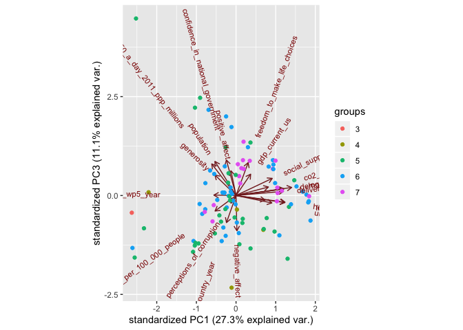
ggbiplot::ggbiplot(happiness_PCA, choices = c(1,3), groups = factor(happiness_original_na$happiness_score))
ggbiplot::ggbiplot(happiness_PCA, choices = c(2,3), groups = factor(happiness_original_na$happiness_score))
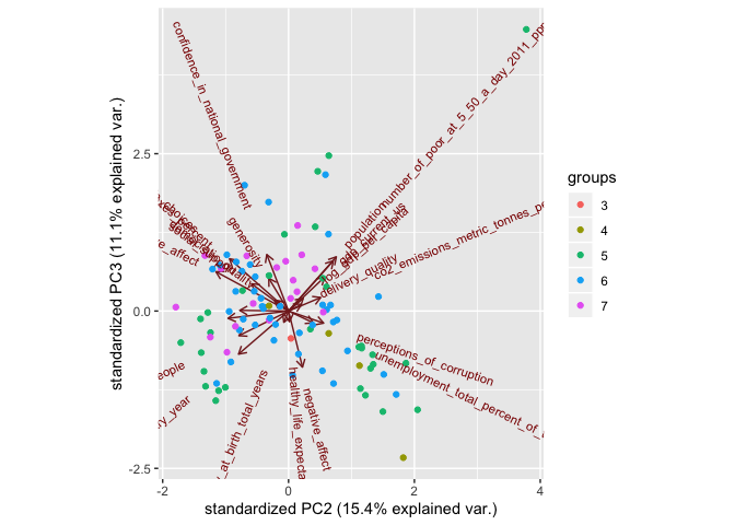
Here we have made biplots from the three principal components that account for the highest variation in the data set and have colored by the respective points happiness score. (Similar biplots can be made for all combinations of principal components).The most striking feature of these biplots was that there were a cluster of points around the origin that were the ranked as the happiest countries. This could mean that governments should not particually focus on one particular indiactor but concentrate on the overall developoment of the country.
We could improve the above PCA if we had imputed values for the rows that had a few enteries as N/As. This way we could have retained more information and more countries and hence are PCA would have been able to reveal more information between the happiness and the various different indicators.
Limitations and Next Steps
One of the main limitations from our analysis comes from the available migration data — both in time period and who is recorded. The UN was able to track only recorded migration, which excludes undocumented migrants and those who go missing when leaving a country and going to another; this excludes significant populations of migrants, which affect total counts for country-level inflows and outflows.
Another limitation we had to work with is the fact that the happiness data only began being surveyed in 2008, so though we have migration information from well before this time period, we had to exclude many years in order to align datasets. It would have been interesting to compare our analysis with years prior to the recession as well, since we can assume economic levels were more stable. Since data is still being collected for the last 5-7 years on migration, we have data missing for some countries and could have a more complete dataset with more countries if this were not the case. Further, since 2013 is only 5 years after the hit of the recession, we would think countries are still recovering so our results could be confounded by this and we would have seen larger contrasts in happiness and in migration once the world economy is fully recovered, as a recession does not have small consequences.
Because we use Citizenship as a measure of where someone came from as part of country inflows, this could make totals a bit different than direct country migration, as someone could be living outside of their country of citizenship; however, this measure allowed us to be consistent across all countries included and provided the most data. We can only generalize these results for OECD countries, not all countries in the world. Further, we are missing some OECD countries, namely those in Latin America (Mexico), and Asia (Japan, Korea) due to the lack of recording at the individual country level for inflows and outflows.
As more time passes, the UN and similar institutions are able to compile data for future years to improve the network analysis for migration to be more up to date; as this was our limiting data factor, ultimately this would help us use more recent indicator variables and see if the world and the US particularly out of a full recovery from the 2008 Recession for further comparison. Further, connecting this work to projects like the Missing Migrants Project can extend the analysis to how migrants can go missing during the process and what routes pose bigger risks and try to factor these measures into Happiness as well.
Thank you for stopping by our blog page and we hope to be back with more updates soon!
References
Background:
- https://www.pewresearch.org/fact-tank/2019/06/17/key-findings-about-u-s-immigrants/
- https://www.brookings.edu/research/a-dozen-facts-about-immigration/
- https://ec.europa.eu/jrc/sites/jrcsh/files/theoriesofmigration2.pdf
- https://www.youtube.com/watch?v=fiPq7C06zjQ
- https://www.thebalance.com/organization-economic-cooperation-development-3305871
- https://science.sciencemag.org/content/343/6178/1520
Data for network and happiness:
UN DESA: https://www.un.org/en/development/desa/population/migration/data/estimates2/estimates15.asp Gallup World Happiness Report (Online Data): https://worldhappiness.report/ed/2017/?fbclid=IwAR0YSIZ-OpZLbJtb76x4XYiyCk_0BGRcklVbxkv30rAwklP7FKPwFrlEI54 World Bank: https://microdata.worldbank.org/index.php/catalog
Variable Code Book: https://docs.google.com/document/d/1j7Ea_wBD7tiRS14zOptOJ0KYrWh6nC8mcqC8YAHo-fk/edit
Key Packages:
ggnetwork, igraph, intergraph, dplyr, tidyr, mosaic, devtools, ggfortify