STAT 231 Group G
STAT 231 Group G
Introduction: A $32.3 billion situation…
In FY 2020, $32.3 billion was requested in foreign assistance(1). But is this assistance going to the countries that actually need help? And does the assistance actually improve the public health in these countries? We wanted to explore the association between countries’ statistics associated with health quality and their reception of humanitarian foreign aid from the U.S.. We were also interested in whether the U.S. decides where its foreign aid is directed based on humanitarian reasons, and whether the aid is efficacious.
Data:
Our 2 primary data sets were :
1) The World Bank’s international health data set from BigQuery. This
data set contains a wide variety of health statistics by country across
time. We accessed the data through BigQuery. The format is narrow, with
each unique observation in its own row. We looked at the years 2000 and
2015.
(https://console.cloud.google.com/marketplace/details/the-world-bank/global-health?filter=solution-type:data
set&q=global&id=f3c38e10-2c45-43c8-8a12-8d749ba987ee)
2) The Federal Aid Explorer data set from the USAID government website.
These two data sets are very large and cover many years. It is also in a
narrow format and includes the country, the region, the department, the
reason for aid (HIV/AIDS, Emergency Response, etc), the current amount,
and the recurring amount.
(https://console.cloud.google.com/marketplace/details/the-world-bank/global-health?filter=solution-type:data
set&q=global&id=f3c38e10-2c45-43c8-8a12-8d749ba987ee)
Wrangling:
Wrangling our data sets was a relatively straightforward process given that our data sources were well maintained. Our World Bank data set came from BigQuery where we ran the following query to get data on health indicators for the years 2000 and 2015. Similarly, for the Federal Aid data, we ran a query to get all foreign aid entries for years 2000 and 2015.
Our final data format needed to be in two forms. First, a data set where each observation represented a country during a specific year, the first PC from a PCA of its health indicators, and the total foreign aid for humanitarian reasons allocated to that country. This data set was used to determine the relationship between foreign aid allocation and health outcomes, IE: whether aid is going to the countries that need it the most. Second, a data set where each observation represented a foreign aid amount for a particular country, year, and humanitarian purpose. This data set helped sum up how aid was distributed across humanitarian purposes (disaster relief, sanitation, food assistance, etc) and changes from 2000-2015.
World Bank Data:
This data was in a narrow format where each country had an observation for every health indicator and year. This meant for the ~200 variables there was an observation for each year, and country, resulting in a huge data set. To get it in a workable format we first filtered for the years 2000 and 2015 in our SQL query. After that we changed the data set to a wide format, and then filtered out all of the variables not related to health. The data set contained a wealth of information, but many variables were simply measurements of demographics like income level or % of population that is in a certain age group. These variables don’t speak directly to health measurements so we used an str_detect function to remove all unnecessary variables. After that we went through and manually removed other unrelated variables, leaving us with a final total of 78 health indicator variables, plus the country name. We performed PCA on the 78 health indicator variables. Our first principal component accounted for 41.08% of the variance present in our original 78 variables. This principal component loaded positively on measures of health (such as Life expectancy at birth and survival to age 65 as % of cohort), and negatively on measures of sickness (such as Cause of death by communicable diseases and infant mortality rate). Thus, we interpreted our first PC as a quality of health indicator for our observations.
Foreign Aid Data:
First, we removed all observations in this data set that did not relate to humanitarian reasons. A bulk of U.S. foreign aid is for military reasons and falls outside of the scope of our question. Additionally, there were negative values that represented loan repayments. After filtering, this left us with 171 foreign aid reasons which we filtered down to 29 that related to humanitarian reasons (HIV, Malaria control, food assistance, etc). Finally, we grouped all these observations to find the totals by country and year, and by country, year, and reason. Having finished the wrangling of both data sets, we joined them using country name and year to create the variations of the final data set we wanted.
Where does the US send its Foreign Aid?
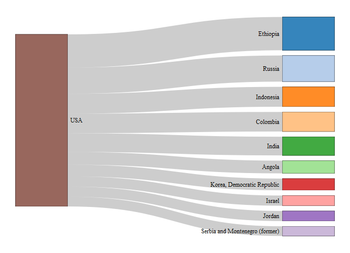
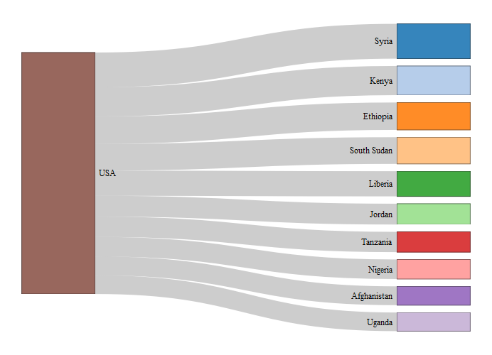
First, we can look at the Sankey diagrams, using the networkD3 package
to see the top 10 foreign aid recipients for each year.
Top 10 recipients of aid in 2015
## Nodes is a tbl_df. Converting to a plain data frame.
 #Top 10
recipients of aid in 2015
## Nodes is a tbl_df. Converting to a plain data frame.
 These
diagrams are not too revealing of where aid goes, because it only lists
the top 10 for each year. We can see in 2015 the top foreign aid
recipient was Syria, corresponding to the unrest in 2015, and in 2000
Ethiopia was the top foreign aid recipient, corresponding to the
Ethiopian famine from 1988-2000.
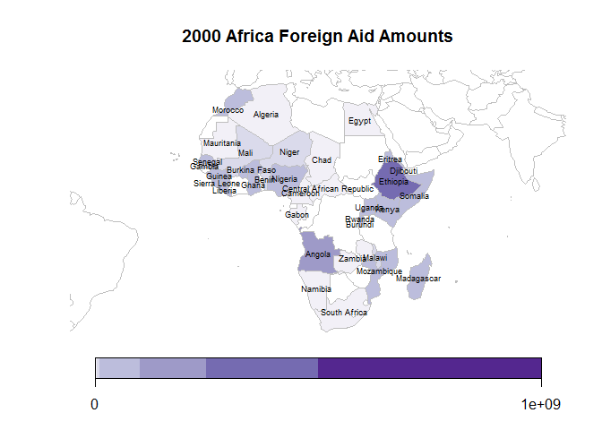
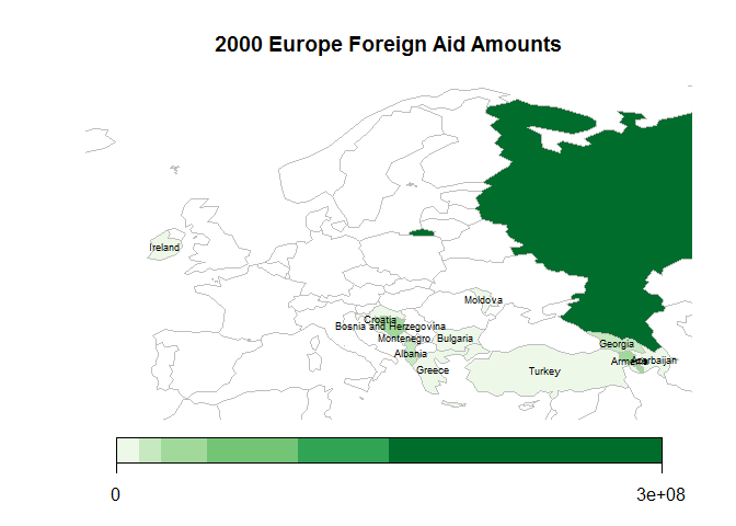
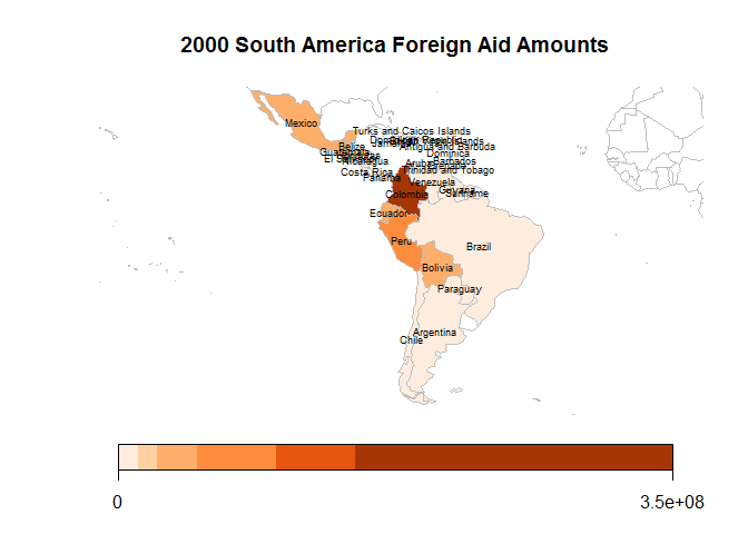
We can look more generally on a spatial diagram to see how the US
distributes foreign aid. Here, we used rworldmaps package to create
plots of each continent. The countries on each continent are colored by
their aid amounts based on the foreign aid amount category they fall in.
Each continent is scaled by a semi-log scale based such that there are 6
buckets. Additionally North America and Australia are not included
because they only contain single countries.
## 34 codes from your data successfully matched countries in the map
## 0 codes from your data failed to match with a country code in the map
## 209 codes from the map weren't represented in your data
## 47 codes from your data successfully matched countries in the map
## 0 codes from your data failed to match with a country code in the map
## 196 codes from the map weren't represented in your data
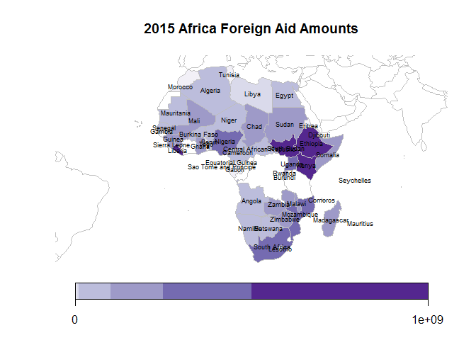 Overall,
aid has increased drastically throughout all of Africa, most notably in
Ethiopia, South Sudan, Kenya, and South Africa. This may correspond to
increased aid for the HIV/AIDS epidemic that is particularly intense in
South Africa. Additionally, Liberia received a large increase in foreign
aid, possibly because of the Ebola outbreak in 2014-2015.
## 14 codes from your data successfully matched countries in the map
## 0 codes from your data failed to match with a country code in the map
##      failedCodes failedCountries
## 229 codes from the map weren't represented in your data
## 21 codes from your data successfully matched countries in the map
## 0 codes from your data failed to match with a country code in the map
##      failedCodes failedCountries
## 222 codes from the map weren't represented in your data
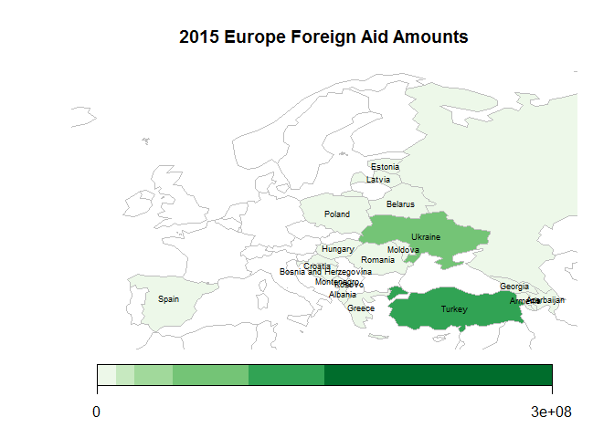 Aid is
relatively low in Europe in 2000, primarily going to Russia. We are
unsure as to what the reason is for the humanitarian aid going to
Russia, but nearly all of it was in food assistance. By 2015 we see that
aid has shifted to eastern European countries and former Soviet Union
countries. The bulk of it is going to Ukraine and Turkey for material
relief and assistance.
## 30 codes from your data successfully matched countries in the map
## 0 codes from your data failed to match with a country code in the map
##      failedCodes failedCountries
## 213 codes from the map weren't represented in your data
## 25 codes from your data successfully matched countries in the map
## 0 codes from your data failed to match with a country code in the map
##      failedCodes failedCountries
## 218 codes from the map weren't represented in your data
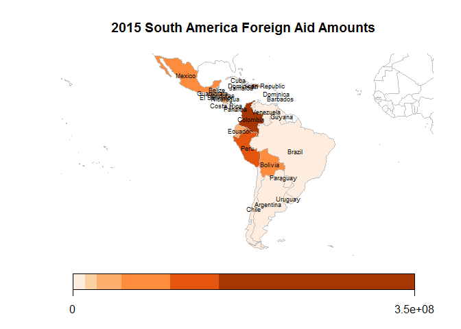 Aid
amounts in South America have remained relatively constant with slight
increases in Mexico, Ecuador, and Peru. The increase in aid for Peru may
correspond to the aftermath of the 2007 earthquakes.
## 24 codes from your data successfully matched countries in the map
## 0 codes from your data failed to match with a country code in the map
##      failedCodes failedCountries
## 219 codes from the map weren't represented in your data
## 31 codes from your data successfully matched countries in the map
## 0 codes from your data failed to match with a country code in the map
##      failedCodes failedCountries
## 212 codes from the map weren't represented in your data
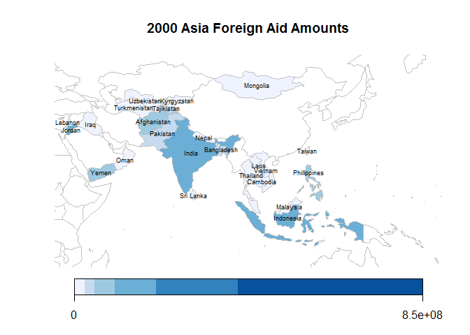
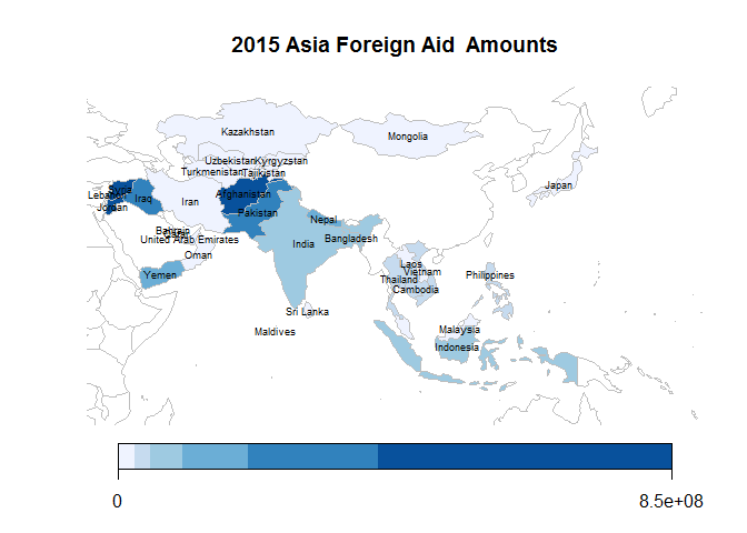 Aid in
Asia has primarily gone to South Asian and Southeast Asian countries,
with notable increases to Afghanistan, Pakistan, and the Middle East in
2015.
Why does the US give Foreign Aid to Other Countries?
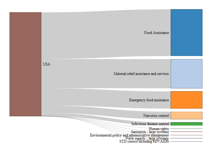
First, looking broadly at total US foreign aid, in 2000 the US dedicated 23 billion to foreign aid, with 4.3 billion going to humanitarian aid. In 2015 the US dedicated 50 billion to foreign aid, with 19 billion going to humanitarian aid. For broader exploration of foreign aid trends we recommend the US foreign aid explorer (https://explorer.usaid.gov/aid-trends.html) #Top 10 Funding Reasons for 2000
## Nodes is a tbl_df. Converting to a plain data frame.
## Nodes is a tbl_df. Converting to a plain data frame.
 #Top 10
Funding Reasons for 2015
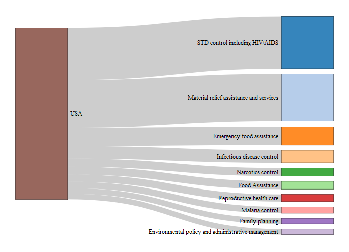 (plots) We can
note some interesting trends from these two plots. First, we see that
the biggest increase in aid amount is STD control including HIV/AIDS.
Historically, HIV/AIDS is a relatively new disease and only within the
past two decades have serious efforts been made to support other
countries dealing with STD control. Second, we see that “material relief
assistance and services” and “emergency food assistance” are the 2nd and
3rd biggest reasons for humanitarian aid for both years. This makes
sense since both deal with natural disaster relief, something that
happens consistently every year across the world. Finally, “food”
assistance has moved down from 1st to 6th. This may correspond with the
fact that global undernourishment has dropped from 15% to 10% of the
total population from 2000 to 2015 (2).
Does the US give based on a country’s public health?
One of the original questions we sought to answer with our investigation was whether the severity of a country’s public health crisis is a strong determining factor of how much humanitarian aid that country receives. Using a measure of a country’s public health (our first PC), we sought to predict the amount of aid a country receives. An initial plot is not revealing:
## Parsed with column specification:
## cols(
##   country_name = col_character(),
##   year = col_double(),
##   wbdpca_scores_pc1 = col_double()
## )

## Warning: Column `country_name` joining factor and character vector,
## coercing into character vector
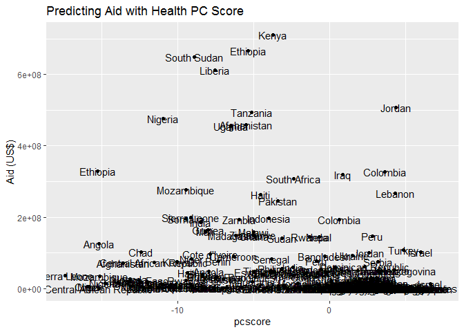
We transformed our y value using log() and then raising them to the 4th power, which yields a more linear relationship.
#Plot for association of aid with pcscore
p1 <- ggplot(final_data_temp3, aes(x = pcscore, y = transaid))+
  geom_point()+
  geom_text(aes(label = country_name))+
  ggtitle("Predicting Transformed Aid with Health PCA Score") +
  xlab("PCA Score")+
  ylab("Transformed Foreign Aid (dollars)")
p1
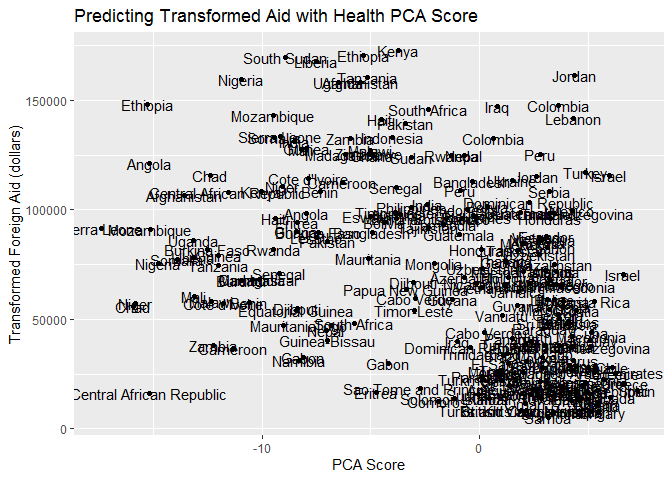 We see
that there is a negative association between a country’s health, as
measured by our indicator, and the amount of aid the country receives.
Our models suggest that better public health within a country is
generally associated with less U.S. foreign aid. However, even after
linearizing the relationship between these variables, a country’s public
health accounts for a mere 16.36% of the variation in the transformed
amount of aid received. These results would suggest that while a
country’s poor health is associated with the amount of aid the U.S.
gives, there are clearly other factors in the aid decision process.
Does US aid improve a country’s public health?
An obvious follow up question to our findings is whether U.S. foreign aid decisions appear to be associated with an improvement in a country’s public health. To answer this question, we looked at the amount of aid countries received in 2000, and the change in our health measure, from 2000 to 2015. A positive change would indicate a country’s public health improved; a negative would indicate a decrease in health. Using the transformed measure of foreign aid as our predictor, we saw the following association:
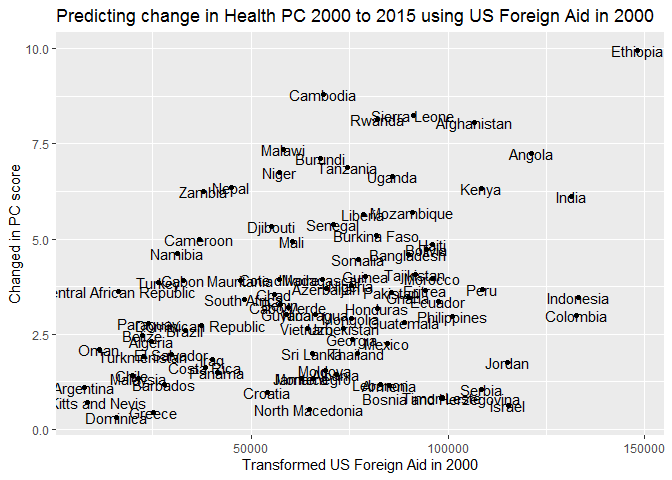
We see a weak, positive, linear relationship between our transformed U.S. aid in 2000 and the change in public health. We note that under this linear transformation, only 11.62% of the change in the countries’ public health from 2000 to 2015 is explained by the transformed amount of U.S. foreign aid. We cannot infer causation, but we conclude that there is indeed an association between the amount of U.S. foreign aid a country received in 2000 and the improvement in public health later, in 2015.
Conclusion:
The investigation of our original questions resulted in the following major takeaways:
- Using Sankey diagrams we can look at the changes in foreign aid funding reason and recipients
- We can also use spatial plots to look at the distribution of foreign aid funding across different countries
- There is a weak, negative association (not causation) between a country’s health and the amount of foreign aid the U.S. gives that country
- The amount of foreign aid a country received in 2000 has a weak
positive association (not causation) with the improvement in public
health that country experienced over the period 2000 to 2015
For more information (and interactive plots), please visit our Shiny application. The link to our Shiny application:
https://klindziuk-liubou-yuuna.shinyapps.io/USForeignAid/